Note
Go to the end to download the full example code.
Custom Scalar Visualization#
Display custom scalars using an existing mesh.
import numpy as np

from ansys.mapdl.reader import examples

# Download an example shaft modal analysis result file
shaft = examples.download_shaft_modal()
Each result file contains both a mesh property and a grid
property. The mesh property can be through as the MAPDL
representation of the FEM while the grid property can be through
of the Python visualizing property used to plot within Python.
print("shaft.mesh:\n", shaft.mesh)
print("-" * 79)
print("shaft.grid:\n", shaft.grid)
shaft.mesh:
 ANSYS Mesh
  Number of Nodes:              27132
  Number of Elements:           25051
  Number of Element Types:      6
  Number of Node Components:    4
  Number of Element Components: 3

-------------------------------------------------------------------------------
shaft.grid:
 UnstructuredGrid (0x7fac3ec9af20)
  N Cells:    25051
  N Points:   27132
  X Bounds:   0.000e+00, 2.700e+02
  Y Bounds:   -4.000e+01, 4.000e+01
  Z Bounds:   -4.000e+01, 4.000e+01
  N Arrays:   16
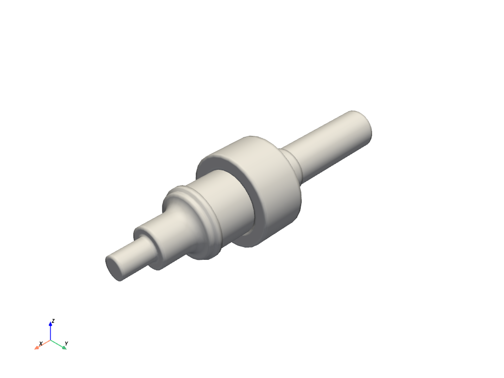
Plotting#
The grid instance is a pyvista.UnstructuredGrid part of the pyvista library. This class allows for advanced
plotting using VTK in just a few lines of code. For example, you can plot
the underlying mesh with:
shaft.grid.plot(color="w", smooth_shading=True)
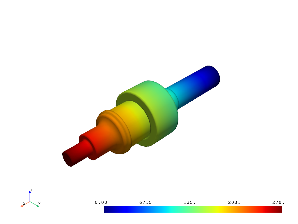
Plotting Node Scalars#
If you point-wise or cell-wise scalars (nodes and elements in FEA),
you can plot these scalars by setting the scalars= parameter.
Here, I’m simply using the x location of the nodes to color the
mesh.
It follows that you can use any set of scalars provided that it matches the number of nodes in the unstructured grid or the number of cells in the unstructured grid. Here, we’re plotting node values.
x_scalars = shaft.grid.points[:, 0]
shaft.grid.plot(scalars=x_scalars, smooth_shading=True)
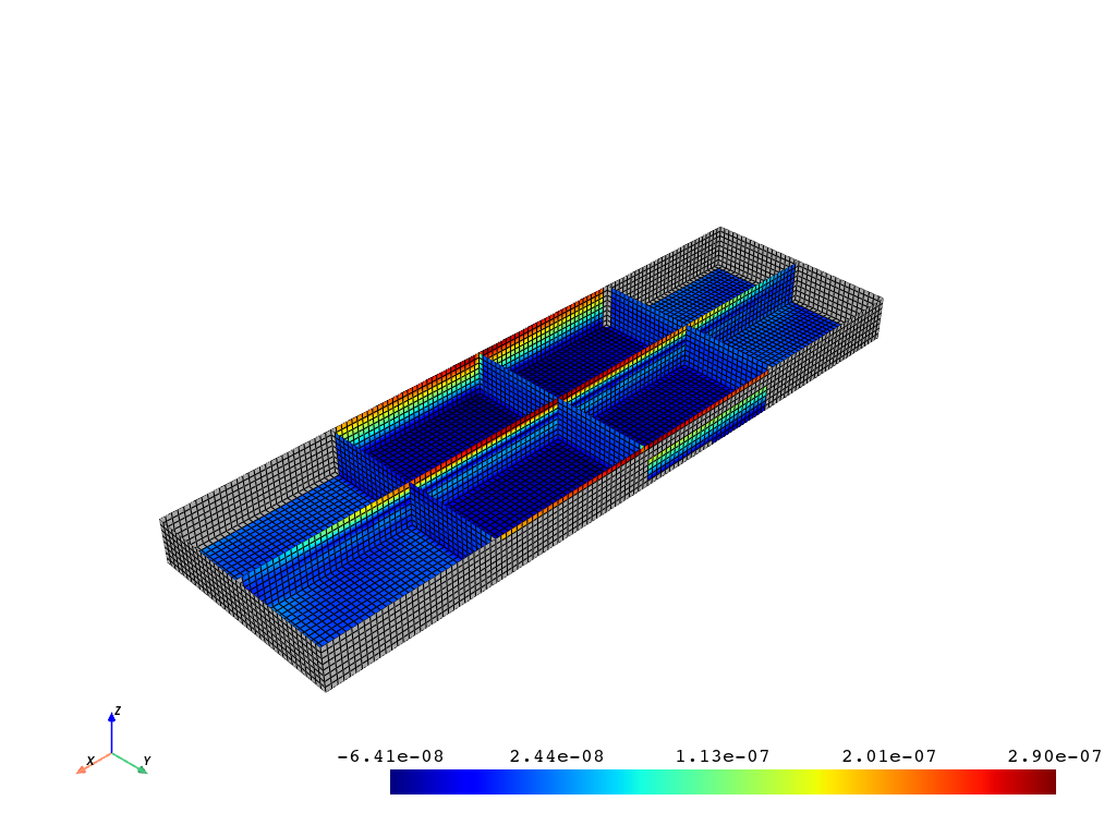
Plotting With Missing Values#
If you do not have values for every node (for example, the midside nodes), you can leave these values as NAN and the plotter will take care of plotting only the real values.
For example, if you have calculated strain scalars that are only available at certain nodes, you can still plot those. This example just nulls out the first 2000 nodes to be able to visualize the missing values. If your are just missing midside values, your plot will not show the missing values since pyvista only plots the edge nodes.
Total running time of the script: (0 minutes 5.332 seconds)